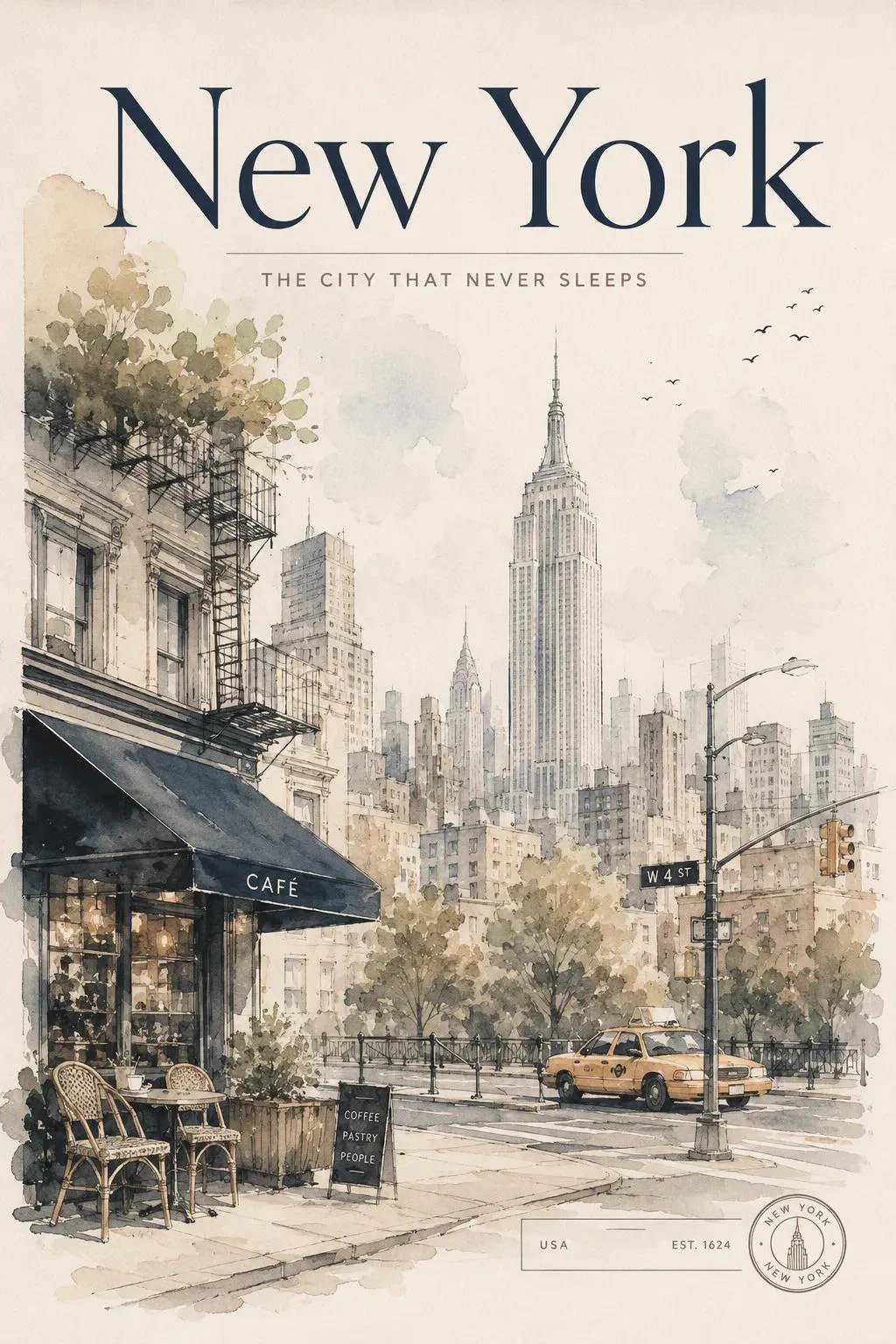
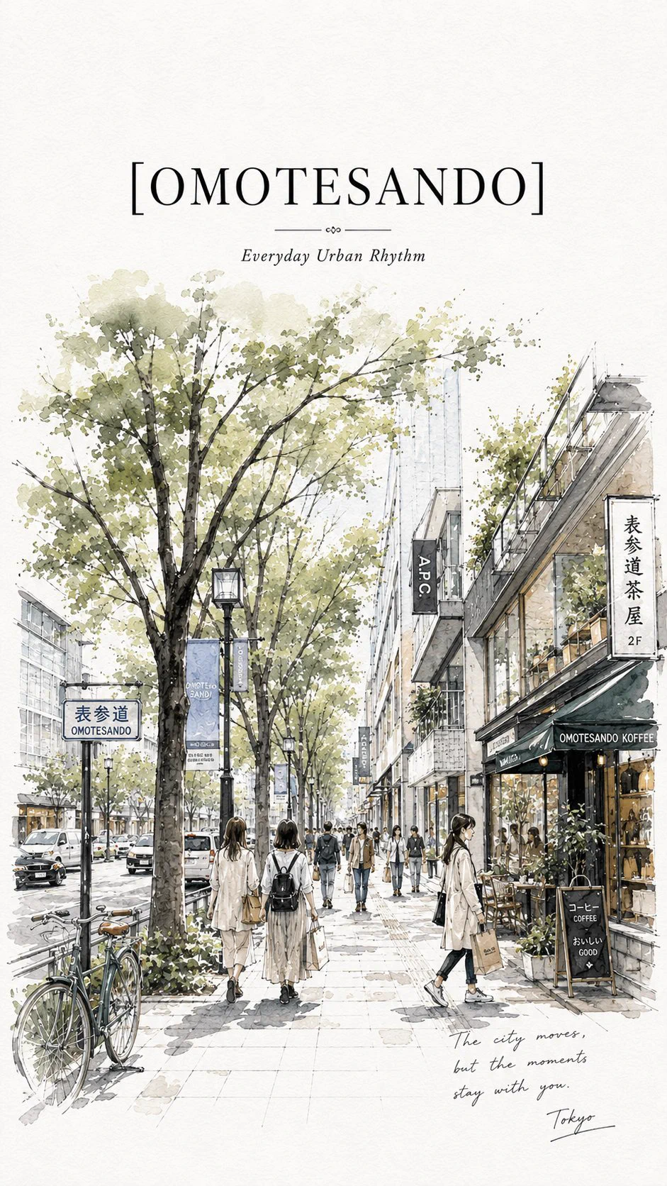
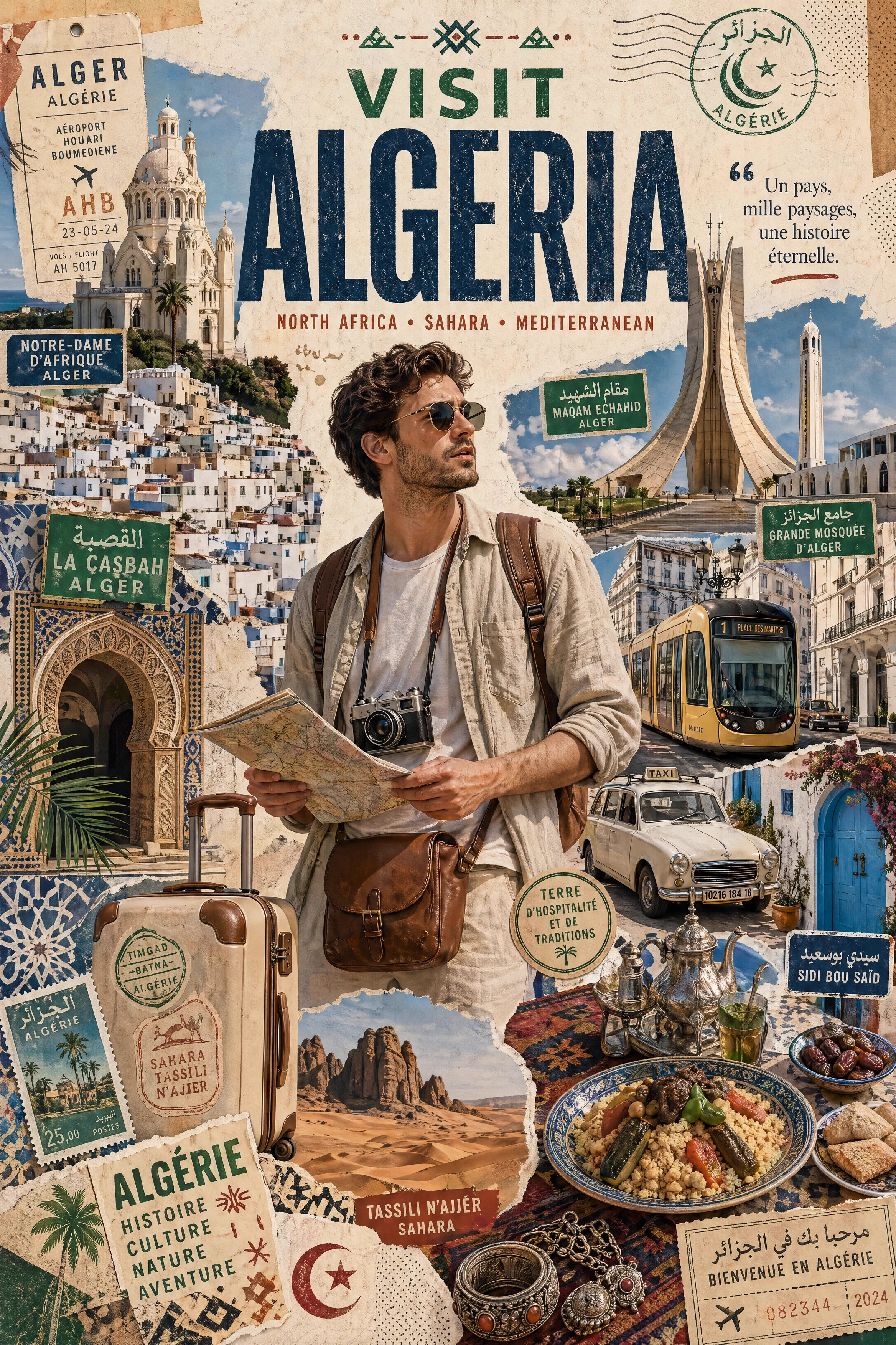
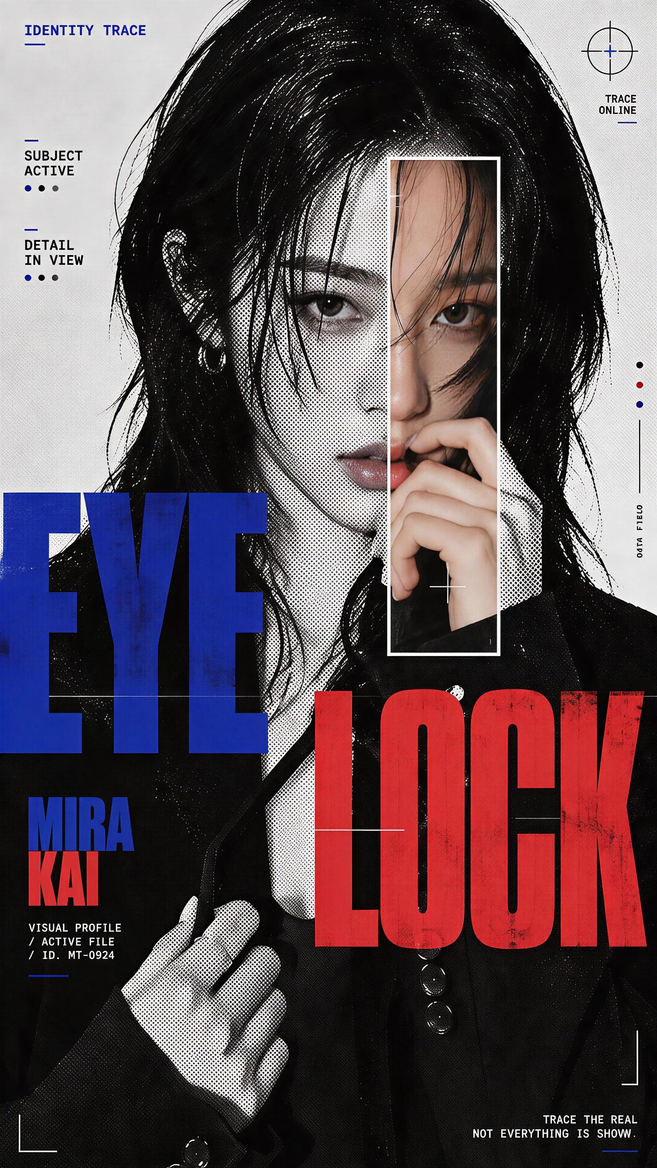
Four destination posters use watercolor, ink linework, textured paper, and restrained editorial typography. Architecture and a quiet cafe establish the destination, while ink contours hold the buildings together beneath loose watercolor washes. Serif city names and generous paper margins give the series a consistent hierarchy; four images are outputs of one brief.
How to adapt the method
Preserve the watercolor-and-ink system, paper texture, and negative space while changing the destination and architecture. Replace the place name, buildings, signs and supporting details together. Check that the chosen landmark belongs to the destination and that lettering stays readable; watercolor texture should not erase the architecture.
How to use this prompt
1
Read the complete prompt alongside the result. Identify the subject, framing, lighting and visual style before changing the brief.
2
Open the selected recipe in Studio with its model and starting settings. Check the available version, frame and resolution before generating; a size written in the source prompt is not an output setting or a guarantee.
3
Use the customization fields below to rewrite the brief: destination / architecture / atmosphere. Keep the composition and other constraints that make this example useful. Check the current credit quote before submitting.
What to check in your result
Compare the result with the chosen example: subject position, light direction and the balance between foreground and background. Inspect hands, faces, product shapes and any text at full size. Change one variable at a time so you can judge what improved.