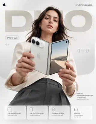
Both prompts build the poster in layers: a large background word, a person holding the phone toward the camera, and four feature cards at the bottom. The enlarged foreground device creates depth, while the headline and cards provide a reading order. The orange direction uses a white canvas, warm edge light and restrained graphics; the violet direction adds a dark gradient, cooler light, a subtle grid and a stylus. Compare how those choices change the mood without changing the product-first structure.
- brand
- Apple or Samsung
- product
- premium smartphone
- headline
- short dominant promise
Read the full case and original prompt →The diagonal bottle gives a top-down beach composition its main axis. Wet sand, shallow water, foam and golden reflections supply the summer mood without extra props. The wave partially covers the label, creating a useful tension between atmosphere and product readability. Four displayed outputs come from one source prompt.
- product
- fictional cosmetic serum in a dropper bottle
- surface
- wet sand crossed by a small wave
- light
- warm late-day sunlight
Read the full case and original prompt →The source prompt makes the snap of the chocolate bar the centre of the poster. Crumbs, shards and cracked lettering radiate from that point; the oversized product sits in the foreground, while neutral clothing keeps the red palette dominant. The intended reading order is headline, snap, product and call to action. The four published images share one source prompt in this record, rather than four separate recipes.
- product
- fictional chocolate bar with original packaging
- motion
- snap, crumbs, wafer, and chocolate suspended in air
- hierarchy
- large slogan, product hero, benefits, and call to action
Read the full case and original prompt →